War Report #1

The scenario translation for War of the Human Tanks is proceeding at a great speed ever since we concluded our work on the game’s rather extensive battle logic. 7 of the game’s 13 chapters have now passed through editing. While initially preparing the hand drawn maps was being delayed by the script translation since we wanted them to reflect the battlefields as accurately as possible, the maps have now trouble keeping up. This doesn’t affect our release schedule, since there are a lot of other steps to go through even after translation is complete.

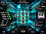
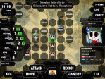
We wouldn’t want anyone to get bored while waiting, so we opened up three more sections of the War of the Humans homepage and updated the screenshot gallery. By browsing the System Tab and its sub pages you can learn about many aspects of our game and how to play it. These pages double as the game’s online manual. Have fun checking them out.

As a special thanks for the thousands of people who watched our first teaser trailer this week, here is a clear sketch from one of the scenes in War of the Human Tanks:

Hand drawn maps

While showcasing War of the Human Tanks to our friends in the early stages of the project, a common and more or less universal feedback we got was that the battle backgrounds (which you can see in various screenshots we have online at the moment) look too abstract. My friend Serkan Sanver who works as a game designer, made a specific suggestion to make the backgrounds display the terrain shape instead to make them more approachable.


I discussed this idea with the team, and we all shared the same general opinion that having maps in the background would be a good improvement. What this could mean in practice was a matter for more debate and dozens of experiments in different styles. When we brought the option up with Yakiniku Banzai, the original developers, they gave the change the green light. The funny thing is, it turns out they already had the same idea and had employed a similar feature in their latest title, Recycle Princess, which is still in production.

Eventually we decided to follow the same general style Yakiniku Banzai had turned to, albeit with a somewhat more modern touch since Recycle Princess is set in a fantasy setting.

I asked Yulay Devlet, a talented art designer friend of mine who also designed our cute logo, to take on the task and he accepted the challenge. After bouncing a lot of drafts we were able to reach a consensus on the style and details, and a complete version of our first map was created. Here you can see it being used in the first battle of the game, Ookawahara Battery Recapture.

Human Tanks English logo

War of the Human Tanks Japanese Logo

Above is the original Japanese logo for War of the Human Tanks. As you can see the ‘series’ name is emphasized heavily in the proportions.

I prepared many alternative versions and our team picked their favorite from amongst those. That one went over many, many changes over the course of several days, and finally came out as the version you can see below.

I hope you like the design as much as we do.

War of the Human Tanks English Logo

This is naturally just one handpicked detail I wanted to share with everyone. This particular image is important because you will be seeing it everywhere.

The progress overall has been rapid with each team member exploring different aspects of the game. Stay tuned!